

 The Accurate Reloading Forums
  THE ACCURATE RELOADING.COM FORUMS
  Guns, Politics, Gunsmithing & Reloading
  Gunsmithing
  Which do you like?
Go  | New  | Find  | Notify  | Tools  | Reply  |  |
| One of Us |
No reason needed, just let me know the one that looks the best to you. Thanks. 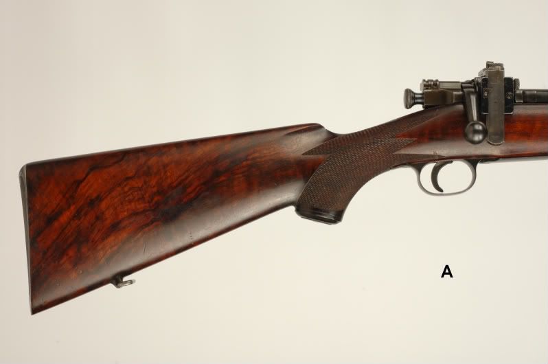 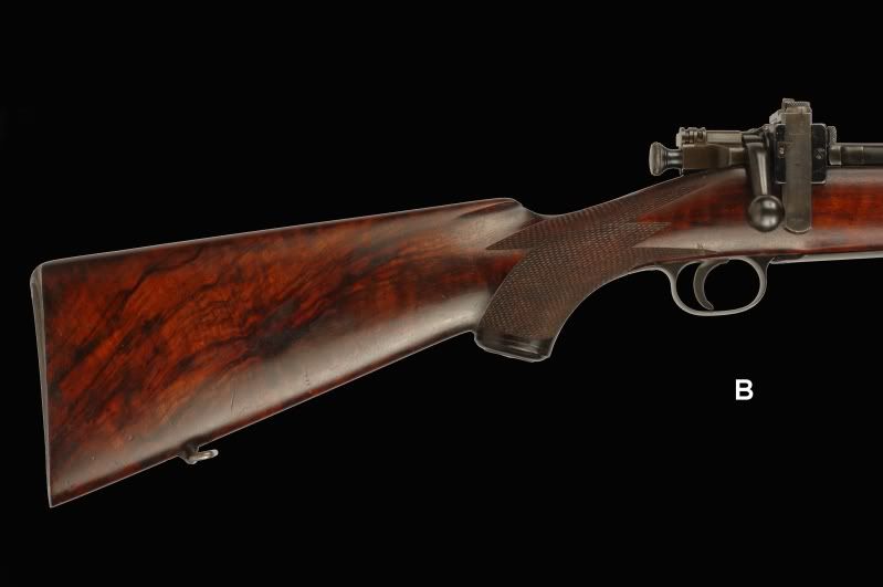 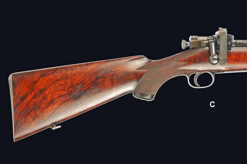 | ||
|
| One of Us |
C, although I might be tempted to tone down the real bright highlights just a bit with photoshop. (Edit: Background in A looks muddy and the gun is too flat. Same in B. gun is too flat but better than A (look at difference in checkering detail) C shows good detail in the sight but highlights too bright. Metalwork in C has good contrast and detail.) | |||
|
| One of Us |
A | |||
|
| one of us |
I'll make it unanimous.....B..... which really is my preference. xxxxxxxxxx When considering US based operations of guides/outfitters, check and see if they are NRA members. If not, why support someone who doesn't support us? Consider spending your money elsewhere. NEVER, EVER book a hunt with BLAIR WORLDWIDE HUNTING or JEFF BLAIR. I have come to understand that in hunting, the goal is not the goal but the process. | |||
|
| One of Us |
Number two. RG | |||
|
| one of us |
B **************** NRA Life Benefactor Member | |||
|
| one of us |
A | |||
|
| one of us |
I actually like A the best. Is this a test for your new book? ****************************** "We do not exaggerate when we state positively that the remodelled Springfield is the best and most suitable "all 'round" rifle".......Seymour Griffin, GRIFFIN & HOWE, Inc. | |||
|
| One of Us |
Door #3 Dennis Life member NRA | |||
|
| One of Us |
B for me! | |||
|
One of Us |
I would go with A Michael , B looks like there is to much reflection from the bottom metal and C looks chrome plated. whats your favored image?? It's mercy, compassion and forgiveness I lack; not rationality. | |||
|
One of Us |
i would like somewhere between B and C, if that is not possible then B best regards peter | |||
|
one of us |
Put me down for A. It's easier on the eye's. Terry -------------------------------------------- Well, other than that Mrs. Lincoln, how was the play? | |||
|
| new member |
No contest. It has to be A. | |||
|
| one of us |
I like A Maybe do a C with white back ground | |||
|
| one of us |
A A black background seems "unnatural" to me and I have a more difficult time determining just what colors the wood really shows. Dark backgrounds also make the glare problem stand out more. Yummy wood in that one! | |||
|
| One of Us |
Go with a light background. Much more forgiving of mask inaccuracy. I find that edge distracting. Sample C seems unnaturally saturated. Forgive me for taking a small liberty. I took 'A' and added a little fill flash.  -nosualc Beware the fury of an aroused democracy. -Ike | |||
|
| One of Us |
Best looking wood in A & B but I can see more detail in C. So I reckon it would depend on what I was after in a photograph and which depicts the truest colors. "Peace is that brief glorious moment in history when everybody stands around reloading". | |||
|
| one of us |
A Allen It's a Mauser thing, you wouldn't understand. | |||
|
One of Us |
It's mercy, compassion and forgiveness I lack; not rationality. | |||
|
| One of Us |
A. | |||
|
| One of Us |
+1 or dawrinmauser's flash fill. DuggaBoye-O NRA-Life Whittington-Life TSRA-Life DRSS DSC HSC SCI | |||
|
| One of Us |
A --- seems more detailed,crisper if you could actually use that to describe a photograph. SCI Life Member NRA Patron Life Member DRSS | |||
|
one of us |
A, better constrast against the light background, detail shows up better. NRA Life Member, Band of Bubbas Charter Member, PGCA, DRSS. Shoot & hunt with vintage classics. | |||
|
| One Of Us |
A looks the best. B and C look a little out of place because of the white light bouncing off of the edges of the rifle. Some black cards placed around the edge of the rifle while photographing it would correct that. With less white relfecting on the edges, the rifle would blend with the black background better. | |||
|
| One of Us |
I like "A" the best. | |||
|
| one of us |
C for seeing the details. A for pure aesthetics. One morning I shot an elephant in my pajamas. How he got into my pajamas I'll never know. - Groucho Marx | |||
|
| One of Us |
A, absoulutely. Bent Fossdal Reiso 5685 Uggdal Norway | |||
|
| One of Us |
I prefer this one ; Doctor photo special !.  | |||
|
| One of Us |
I think A with a black background would be interesting? Of the three I would have to say A. _____________________ Steve Traxson | |||
|
| one of us |
b and c both look unnatural, very flat at the edges. the highlight looks weird. I think this is because you are tkaing you picture then manipulating the background. I'd go A or better take the picture with a different background. IMO photoshopping is for when you have to improvise or make due, if you can change your setup to begin with I think you are better off. I always really liked scrollcutter's pics that had the french blue cloth background. Red My rule of life prescribed as an absolutely sacred rite smoking cigars and also the drinking of alcohol before, after and if need be during all meals and in the intervals between them. -Winston Churchill | |||
|
| one of us |
I like A but I (and I hope it is just my eyes) think they are all three a touch soft in focus. I like a sharper focus with longer depth of field. Frank | |||
|
| One of Us |
I like A | |||
|
| One of Us |
B The price of knowledge is great but the price of ignorance is even greater. | |||
|
| one of us |
B makes that springfield pop! (stand out)  Doug Humbarger NRA Life member Tonkin Gulf Yacht Club 72'73. Yankee Station Try to look unimportant. Your enemy might be low on ammo. | |||
|
| One of Us |
B Sendero300>>>===TerryP | |||
|
| One of Us |
I would say B. But if you could get rid of the light reflecting off the underside of the rifle it would be better. Maybe a long, aperture-controlled exposure in natural light? Mike Wilderness is my cathedral, and hunting is my prayer. | |||
|
| One of Us |
They all look the same to me....the only dif. I see is background color. ________________________________________________ Maker of The Frankenstud Sling Keeper Proudly made in the USA Acepting all forms of payment | |||
|
| One of Us |
D) Take the photo again with an actual black background. | |||
|
| One of Us |
I don't like any of them. I would prefer the dark back ground if the rifle was properly lit. | |||
|
| Powered by Social Strata | Page 1 2 |
| Please Wait. Your request is being processed... |
|

Visit our on-line store for AR Memorabilia

