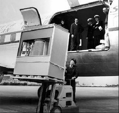
5MB IBM Hard Drive in 1956

5MB IBM Hard Drive in 1956
 The Accurate Reloading Forums
  THE ACCURATE RELOADING.COM FORUMS
  Computers, Hi-Tech & Product Reviews
  Technology
  Web page help please!
Go  | New  | Find  | Notify  | Tools  | Reply  |  |
| One of Us |
We are a Outfitter in Namibia. Small family run bussiness, honest people. Could you please help us and give us some tips as to how to improve our web site. www.baobab.com.na regards Margie | ||
|
| Moderator |
Add prices and daily rate information. No one knows your outfit, so the first criterion for elimination is whether your prices are in line with that of other outfitters offering similar animals and accommodations. I know prices are subject to change, but folks need to know whether you are a $180/day outfit or a $500/day outfit. Next, give an idea of the species available and trophy quality that can be expected. Give an idea of what is included in the daily rate an what is not included. Finally, tell visitors to your site why your outfit stands above your competitors. Good luck, George  | |||
|
| One of Us |
George Thanks for your help. As soon as Iam in town I will do as you suggested. What is your honest opinion of the page? regards from Namibia Margie | |||
|
| Moderator |
Colors and layout are nice. Check every link on every page to be certain there are no broken links (I found one to your "Contact Us"). Whatever you do, DON'T add music! There are people who surf at work, and having Zulu chants or kalimba music blasting out of the speakers while you're supposed to be working on that quarterly report can be embarrassing. George  | |||
|
| One of Us |
George Thanks for your kind reply I do agree. I do a lot of surfing when helping at the local clinic. As I usually work night and have time at about 2 to 4 in the morning I too do not apreciate music on a site!! What would make the site better? Or should we leave it as is? Do you know a web site Tusk and Hides. I think they are outfitters. Have you any information on them? Would appreciate any info. Margie | |||
|
One of Us |
Personally, I think a good web design company is worth it's weight in gold. No offence, but your sight looks like it would be great if it was still 1998, it just seems dated to me. I prefer simple, less is more approach. I like a nice header with easy to use navagation buttons. A simple introduction with one or two pictures goes much further than three or four paragraphs and repeating boarder graphics. your picture gallery is nice, I like the pop up pics, but I think should try breaking them into groups of species, rather than six pages of random pictures. I also think a nice standardized header should repeat at the top of the page from anywhere in the website. One more thing, a client testimonials page should be included. Hope this helps, just one man's honest opinion so it really dosent mean anything unless others agree. ----------------------------------------------------- Do not answer a fool according to his folly, or you yourself will be just like him. Proverbs 26-4 National Rifle Association Life Member | |||
|
| One of Us |
Thanks ever so much for your opinion. It helps a great deal as we want to revamp. If we do not know what the customers are looking for then it is walking in the dark.We in Nam. are a bit behind but I do hope not quite that far. We will have to do some thing. Lets see what others comment. regards from Namibia Margie | |||
|
| Moderator |
I also agree about pricings, you can always put the "subject to change" disclaimer in there. Additionally, you might want to make an informative brochure that prospective clients can download and print out. Some people still like having a hard copy to look at and if it stays on their desk they'll keep seeing it, as opposed to having you bookmarked. for every hour in front of the computer you should have 3 hours outside | |||
|
| One of Us |
Thanks Mark All suggestions and comments help to improve. | |||
|
| Powered by Social Strata |
| Please Wait. Your request is being processed... |
|

Visit our on-line store for AR Memorabilia

